Typography - Task 1
Typography / Bachelor of Design (Honours) in Creative Media
(Task 1)
3. Process - Exercise 1
6. Reflection
7. Further Reading
Week 3
During this class, most of us took turns consulting with Sir to get our sketches approved. In the last hour, he demonstrated how to create animations and explained how to save our files properly to avoid any disruptions or technical issues.
Once our ideas were selected, we moved into the digitization phase, using Adobe Illustrator and Adobe Photoshop. We were provided with a set of ten typefaces and worked through multiple iterations to find the most effective way to communicate each word’s meaning. By manipulating type in both static and motion formats, we aimed to make the words come alive and convey their intended emotion or concept through visual form.
To begin, I researched visual interpretations of the assigned words using Pinterest as inspiration and reference.
I realized that each word could be interpreted in multiple ways depending on its meaning, so I began by researching and summarizing the definitions to spark more creative and varied ideas.
-
Walk - to move at a regular pace by lifting and setting down each foot in turn.
-
Melt - to change from a solid to a liquid state, typically through heat.
-
Shake - to move rapidly back and forth or up and down.
-
Stretch - to extend or lengthen something to its full length or capacity.
Exploring these definitions helped me think more broadly about how each word could be visually represented.
3.2. Ideation

After consulting with Mr. Max, he approved one of my sketches for the work 'shake' and offered suggestions to enhance the others. He encouraged me to think more creatively, as some of my initial ideas were a bit too common and simple. Taking his advice into account, I tweaked my designs and met with him again. This time, he approved one sketch for each word. Then, I began to digitize the approved sketches using illustrator.
Luckily for me, all of my digitized versions got approved by Mr. Max on the first try so I jumped to the animation phase. The word I chose to animate is Shake. I began by creating 16 artboards for each frame.
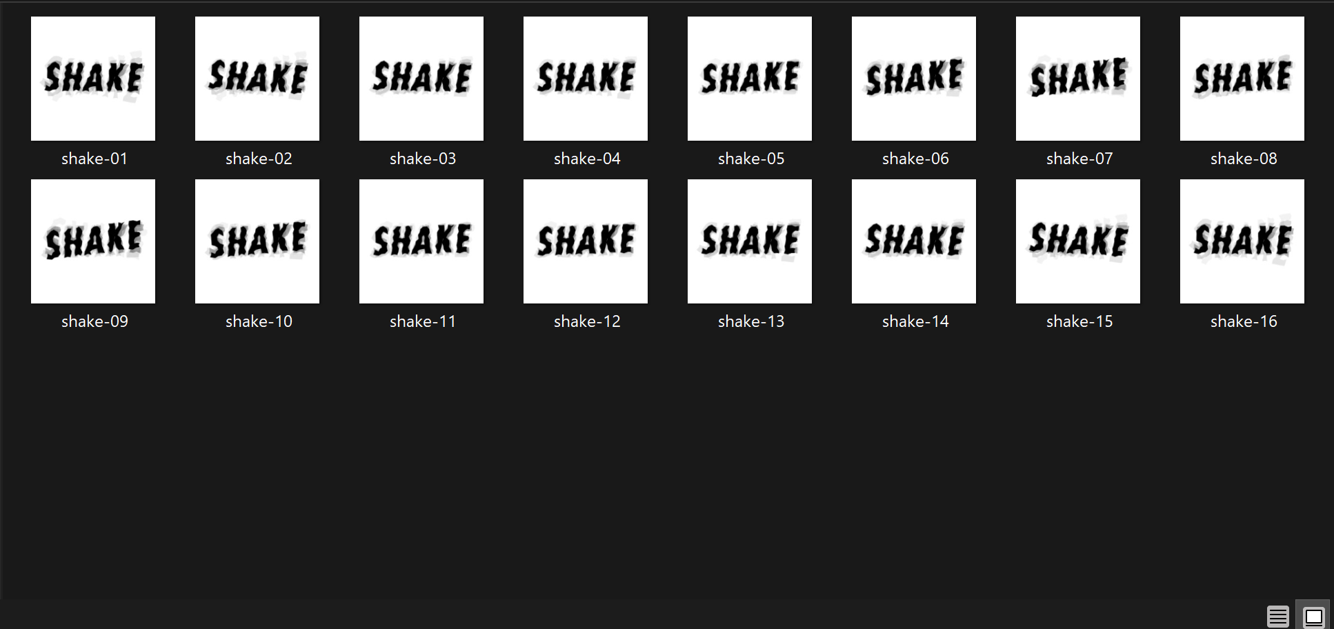
After creating all the artboards, I uploaded the frames into Photoshop to create the animation. I adjusted the timing and the frames to my liking. Once I was happy with the outcome, I exported the GIF.
3.3 Final Outcome

|
| Final Type Expression |

|
| Final Animated Type Expression |
4. PROCESS - EXERCISE 2
4.1. Kerning and Tracking Exercise
I initiated the exercise by selecting typefaces that demonstrate distinctive characteristics, while maintaining a relatively balanced overall visual weight across all ten fonts, despite variations in their individual weights.

|
| Final minor exercise on kerning and tracking |

|
| Digital Exploration - Text Formatting |
After consulting with Mr. Max, he expressed that he preferred options #2 and #4 the most. However, he mentioned that he didn't like the picture placed in the middle of the text in design #4. Taking his feedback into account, I updated the title from design #4 and applied it to design #2.

|
| Final Text Formatting Layout |

|
| Final Text Formatting with Grid Lines |
Over the course of Weeks 1 to 5, I engaged with two key typography exercises: Type Expression and Text Formatting. These exercises were carried out both through sketching and digital design using Adobe Illustrator, and InDesign. The Type Expression task encouraged me to explore how typography alone can communicate meaning and emotion, while the Text Formatting series taught me how to handle large bodies of text effectively and with clarity. I documented each step of my process, from early sketches to digital iterations, as required in my e-portfolio.
Through Type Expression, I observed how subtle typographic elements such as letterform manipulation, spacing, and alignment could drastically change how a word is perceived. Selecting the most appropriate typeface from the given set of ten and experimenting with scale and placement taught me how design decisions can either reinforce or dilute a word’s intended tone.

In the chapter “Letter”, Lupton explains the anatomy of type and how different parts of a letterform (such as ascenders, descenders, counters, and stems) influence readability and design. She also explores how different type classifications (serif, sans-serif, modern, etc.) serve different purposes in communication.
Reading this helped me better understand why certain typefaces feel more formal, modern, or readable than others. It gave me a clearer sense of what to look for when choosing type for specific purposes. For example, I became more aware of how x-height and stroke contrast affect legibility, which informed my choices during the Type Expression task.


Comments
Post a Comment