Task 2: Visual Analysis & Ideation
Recap of Task 2 brief:
- Task 2 focuses on analysing the artwork selected in Task 1. The objective is to investigate its design principles, assess its size, placement, purpose, and overall effectiveness. This involves conducting a detailed visual analysis, examining key elements such as composition, color, balance, contrast, and hierarchy.
- The task requires exploring potential improvements by sketching three alternative ideas. Each sketch must be accompanied by a brief description (30-50 words) explaining the rationale behind the modifications. Visual references may also be included to support the ideation process.
- The final analysis and ideation will be documented in this blog post, incorporating written insights, sketches, and references to demonstrate a deeper understanding of design principles.
 |
| Fig. 1 Victory Boogie Woogie Artist: Piet Mondrian Year: 1944 Dimensions: 127cm x 127cm Medium: Oil and paper on Canvas |
Analysis
The painting has an asymmetrical balance, with elements arranged in a way that creates a natural rhythm. At first, the composition appears random, but upon closer inspection, repetition of shapes and colors brings a sense of order. The eye moves across the canvas, following the scattered patches of color, mimicking the unpredictable nature of jazz music. The absence of black grid lines softens the structure, making the composition feel more fluid.
Contrast plays a major role in this piece. The bright primary colors stand out against the neutral tones, making certain areas pop. The repetition of geometric forms creates unity despite the fragmented layout. Additionally, layering of color and shapes adds depth, guiding the viewer’s focus across different sections.
Interpretation
Piet Mondrian’s Victory Boogie Woogie was inspired by the energy of New York City, but today, its fragmented structure and rhythmic composition reflect the digital age. The scattered squares resemble a pixelated screen, symbolising the fast-paced, ever-changing nature of online spaces and digital communication. The painting’s dynamic flow mirrors how we navigate social media, jumping between content in a non-linear way. Its jazz-inspired spontaneity also parallels the rapid evolution of digital creativity, where trends emerge and fade instantly. By embracing imperfection and movement, Victory Boogie Woogie remains relevant as a visual metaphor for modern technological and cultural shifts.
Design Ideations
1. Glitch and Connectivity
Concept: The image (Fig 1.1) reimagines Mondrian’s work as a digital interface, reflecting the modern internet-driven world. The traditional squares and rectangles will be transformed into a pixelated glitch effect, with some elements appearing distorted or “loading.”
Design Principles:
- Balance: A mix of structured geometric elements and fragmented distortions create harmony.
- Movement: The glitch effect, shifting colours, and faded elements direct the viewer’s eye across the composition.
- Contrast: Bright neon colours replace the original muted tones to enhance the futuristic feel.
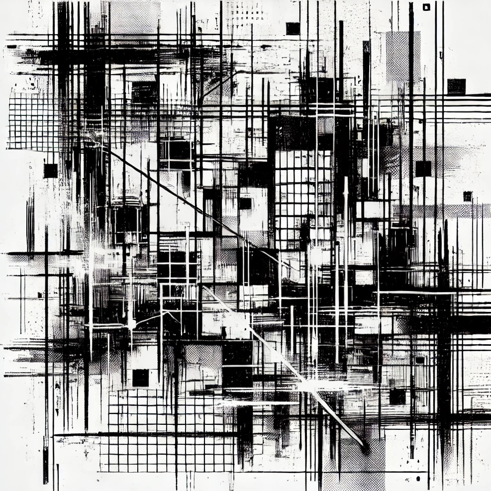 |
| Fig 1.1 Sketch Idea |
 |
| Fig 1.2 Visual Reference |
 |
| Fig 1.3 Visual Reference |
Rationale: Fig 1.1 transforms Victory Boogie Woogie into a glitch-inspired digital interface, representing the modern world’s dependence on technology. The fragmented blocks resemble a pixelated screen or broken data, emphasising how information is rapidly processed and sometimes lost in the digital space. The original primary colour palette iss with neon tones and screen-like gradients, reinforcing a cyberpunk aesthetic. Fig 1.1 maintains Mondrian’s rhythm but introduces movement and contrast through distortion, creating a sense of chaos within structure; a reflection of how the internet influences our perception of reality.
2. Nature vs structure
Concept: Instead of rigid geometric shapes, this rework embraces organic curves and flowing forms, as if Mondrian’s grid were melting into nature. The primary colors would be blended, rather than separate blocks, mimicking natural elements like water, wind, or tree rings.
Design Principles:
Harmony & Unity: Soft transitions and gradients unify the composition.
Movement: The flowing forms guide the viewer’s eyes in a continuous motion.
 |
| Fig 2.1 Sketch Idea |
 |
| Fig 2.2 Biomorphic design |

Rationale: Unlike Mondrian’s strict geometric structure, this idea (Fig 2.1) replaces rigid squares with organic, fluid shapes to reflect natural movement. Inspired by nature’s unpredictability, it introduces elements like watercolour textures and overlapping transparent forms, creating a sense of harmony. The shift from sharp angles to curved, flowing connections symbolises a break from rigid modernity, embracing a more holistic, natural rhythm. A lot of the inspiration for this idea comes from Art Nouveau and Biomorphic Designs (Fig 2.2, Fig 2.3).
3. Cityscape
Concept: Fig 3.1 transforms Victory Boogie Woogie into an abstract 3D cityscape, where the squares and rectangles become floating buildings or layered streets. The artwork extends into depth, creating a futuristic metropolis inspired by digital grids and modern cities.
Design Principles:
Repetition: The use of repeating cube like buildings strengthens the theme of an endless city.
Contrast: Shadows and highlights emphasise volume and separation between structures.
 |
| Fig 3.1 Sketch Idea |
 |
| Fig 3.2 Visual Reference |
Rationale: This version (Fig 3.1) reimagines Victory Boogie Woogie as a three-dimensional cityscape, incorporating architectural depth and perspective. It highlights balance and movement, reflecting how urban landscapes evolve, much like Mondrian’s transition from rigid grids to a more spontaneous composition. By introducing a 3D perspective, this version expands Mondrian’s vision into a spatial and immersive experience, connecting abstraction with physical environments. This idea was influenced by technical sketches such as isometric grids.
Feedback
Week 4: Improve the Interpretation for the visual analysis and further develop the sketches and the idea behind it.
Week 5: Add visual references to the ideations and improve rationale.


Comments
Post a Comment