21/04/25 - 25/07/25 Week 1- Week 14
Aina Ahmed Aleem / 0355701
Typography / Bachelor of Design (Honours) in
Creative Media
(Task 2)
TABLE OF CONTENTS
1. Lectures
2. Instructions
3. Process
3.1. Research
3.2. Ideation
3.3. Final Outcome
4. Feedback
5. Reflection
6. Further Reading
1. LECTURES
Week 1
In this lecture, we were taught the necessary steps to create our
E-Portfolio.
Week 2
During this lecture, Mr. Max taught us the fundamental steps and
essential tools in Adobe Illustrator needed for our assignment.
We explored the tool bar, option bar and workspace, and learned how to
use them effectively to maximize our workflow and design
capabilities.
Week 3
During this class, most of us took turns
consulting with Sir to get our sketches approved. In the last hour, he
demonstrated how to create animations and explained how to save our
files properly to avoid any disruptions or technical issues.
Week 4
We were taught the steps to complete Task 2 and the basics of Adobe
InDesign. Mr. Max provided various examples as reference. and gave
clear instructions on the next step: creating 8 rough sketches for the
article which we are to submit on week 5.
I shared my GIF from Task 1 with Mr. Max, who approved it, allowing me
to move on to Exercise 2.
Week 5
Our Week 5 class was conducted online. During this tutorial, we were
introduced to the fundamentals of Adobe InDesign and were guided
through the essential steps needed to complete Exercise 2 efficiently.
Week 6
We were briefed on Task 2 and was shown examples of senior students
works in class.
Week 7
This was a consultation focus class to complete Task 2 and to show
progression / get feedback.
2. INSTRUCTIONS
Task 2The task involves designing a
2-page editorial spread (200mm
x 200mm per page) using
typography only, based on one
of three provided text options.
Images are not allowed,
unless explicitly permitted. However, minimal graphical elements such as lines
or shading may be used.
The layout and text formatting must be completed in
Adobe InDesign, while
Adobe Illustrator may be
used to create the headline if necessary. Knowledge from previous exercises
and related modules should inform the design approach.
The process should begin with
explorations and sketches
of layout and expression. The final outcome should feature a well-executed
layout with a headline that effectively reflects the
tone and message of the
selected text. A
video tutorial must be
viewed before beginning the task.
3. PROCESS
3.1 Research
I began by researching relevant keywords and exploring Pinterest for visual
inspiration. This helped me quickly generate several ideas, which I then
developed and digitized using Adobe Illustrator.

|
|
Visual References
|
3.2 Ideation
I knew I wanted the word "PUNK" to have a bold, spray-painted, graphic style,
so I experimented with distortion and added textures using Photoshop and
Illustrator to achieve that effect. After that, I created several composition
variations in Illustrator to explore different layouts.

|
|
Digital Explorations
|
3.3 Final Outcome

|
|
Final text formatting and expression (JPEG)
|
Final text formatting and expression (PDF)
Final text formatting and expression with grid (PDF)
4. FEEDBACK
Week 6
General Feedback: Create 6 sketches for Task 2 and experiment with
the letters and graphical elements
Specific Feedback: Approved final
layout for text formatting exercise
Week 7
General Feedback: This session was
a consultation-focused class dedicated to progressing on Task 2. It
provided an opportunity to receive feedback and make improvements.
Specific Feedback: Mr. Max approved the sketch for Task 2, and the final design was
completed during the class.
5. REFLECTION
Experience
While working on this task, I was deciding between exploring the Bauhaus style
or the Punk theme. In the end, I chose Punk because it gave me more creative
freedom and allowed for a more expressive approach to formatting and layout.
This choice helped me experiment with bolder design decisions throughout the
process.
Observations
One of the key things I noticed was the importance of focal points. Where
the viewer's eye lands first and how it moves across the page can completely
change how the message is received. I also saw how layout choices can guide
the reader and affect how easy it is to follow the content.
Findings
Through this task, I learned how to organize text more effectively and
present information in a clearer, more structured way. It also made me more
aware of how layout, spacing, and visual hierarchy play a big role in
shaping the reader’s experience.
6. FURTHER READINGS
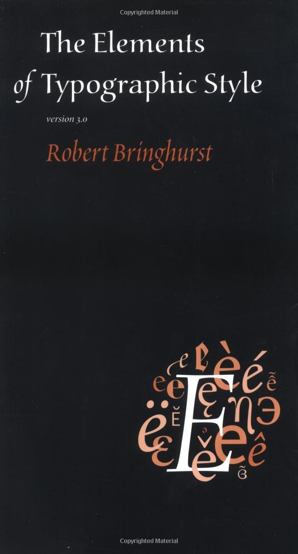
For this task, I read a section from The Elements of Typographic Style by Robert Bringhurst, specifically the chapter on “Rhythm and Proportion”. This section discusses how good typography isn’t just about choosing the right typeface—it’s also about creating a rhythm in the layout through spacing, line length, and alignment. Bringhurst compares typography to music, emphasizing how spacing can create a sense of movement and flow across a page.
From this reading, I learned how small adjustments in line spacing (leading) and paragraph structure can dramatically improve the readability and harmony of a layout. It helped me pay more attention to visual rhythm in my own design and understand how consistency in proportions can lead to a more polished and professional result.


Comments
Post a Comment