Interactive Design - Exercise 1 & 2
Lectures
Week 2: Usability – Designing for User Satisfaction
Usability refers to how easily and effectively users can interact with a
product or interface. It’s a key part of UX design, focused on helping
users achieve their goals without needing expert knowledge.
Core Usability Principles:
-
Consistency: Keep interface behavior predictable.
-
Simplicity: Use clear, uncluttered design.
-
Visibility: Highlight key elements with clear labels.
-
Feedback: Show responses to user actions (e.g., loading animations).
-
Error Prevention: Guide users to avoid mistakes through clear prompts.
Week 3: Website Structure Basics
This topic covers how well-structured websites improve usability and user experience.
Key Concepts:
-
HTML Structure: Headers, footers, nav bars, and content areas.
-
Navigation: Clear menus and links help users find content.
-
Visual Hierarchy: Use size, color, and layout to guide attention.
-
Responsive Design: Adapt layout to different devices.
-
UX Considerations: Design for ease of use and accessibility.
Instructions:
1. National Geographic - Into the Amazon
Purpose and Goals: The “Into the Amazon” website by National Geographic aims to educate and immerse users in the ecological significance of the Amazon River Basin. Through an interactive, scroll-based journey, users follow a single drop of water traveling from the Andes Mountains to the Atlantic Ocean, exploring the landscapes, communities, and wildlife along the way.
The site effectively communicates its mission by blending powerful imagery, storytelling from local communities and experts, and scientific insights, providing an engaging and visually rich experience that highlights the beauty and fragility of the Amazon ecosystem.

|
| Fig 1: Introduction to the websites focus on the Amazon ecosystem |
Design and Layout: The website features stunning high-resolution photography, smooth animations, and a consistent color palette inspired by the natural tones of the Amazon. The typography is clear and easy to read, supporting a smooth visual flow.
Its linear, scroll-based design leads users through the story in an intuitive way, with interactive elements thoughtfully placed to keep the experience engaging and immersive.

|
| Fig 1.2: Example of text and photography combined to enhance storytelling |

|
| Fig 1.3: Example of text and photography combined to enhance storytelling |
Functionality and Usability: The scroll-based layout provides an immersive storytelling experience, though the lack of a traditional navigation menu limits users’ ability to quickly jump between sections.
Interactive elements, such as clickable maps and embedded videos, enhance engagement and provide deeper insights. However, these features may require a stable internet connection for optimal performance, especially for seamless media playback.

|
| Fig 1.4: Interactive map showcasing key ecological regions of the Amazon |
Content Quality and Relevance: The content is well-researched, presenting scientific data alongside personal narratives to provide a comprehensive understanding of the Amazon’s ecosystem.

|
| Fig 1.5: A segment about the cloud forests |
Performance and Compatibility: The website performs well on modern devices with stable internet connections. However, the rich media content may lead to longer load times on slower networks. The design adapts effectively to various screen sizes, ensuring usability across desktops, tablets, and smartphones.

|
| Fig 1.6: Mobile view of the homepage |
Strengths:
- Immersive storytelling through visual and interactive elements.
- High-quality, informative content.
- Responsive design accommodating various devices.
Weaknesses:
- Lack of traditional navigation limits user control.
- Heavy media content may affect load times on slower connections.
Recommendations:
- Introduce a navigation menu for easier access to specific sections.
- Provide options to optimize media (e.g; low resolution images) for users with slower internet connections.
- Improve accessibility features, including text descriptions for images and written transcripts for videos.
Conclusion: “Into the Amazon” is a compelling digital experience that effectively educates users about the Amazon’s ecological importance. By addressing navigation and performance issues, the website can further enhance its accessibility and user engagement.
2. SPYLT - Protein + Caffeine Drink
Purpose and Goals: SPYLT is an e-commerce platform promoting its line of protein-rich, caffeinated chocolate milk beverages. The website is designed to attract a youthful audience, combining playful nostalgia with modern energy to encourage exploration and product purchase. The brand’s message is effectively communicated through vibrant visuals and engaging copy, creating a fun and energetic atmosphere.

|
| Fig 2.1: Homepage showcasing main product and tagline |
Design and Layout: The website employs a bold colour palette with contrasting hues to grab attention. High-quality images and dynamic typography contribute to a modern and energetic aesthetic. The layout is clean, with sections divided clearly, guiding users through the content seamlessly.
Large, playful fonts combined with vibrant images of the products create an immersive experience. The use of whitespace ensures that the content doesn’t feel cluttered, enhancing readability.

|
| Fig 2.2: Visual appeal through bold colours and dynamic design |
Functionality and Usability: The website features a straightforward navigation menu with links to pages like “Shop,” “Tasty Talks,” and “About Us.” The inclusion of interactive elements, such as hover effects and clickable product images, enhances user engagement.
Embedded videos and animations provide dynamic content, offering users a more in-depth look at the brand and its offerings.

|
| Fig 2.3: Interactive elements for enhanced user engagement |
Content Quality and Relevance: The content is concise and informative, detailing product ingredients, nutritional benefits, and unique selling points like being lactose-free and shelf-stable.
Information is well-structured, with clear headings and bullet points that make it easy for users to digest key details quickly.

|
| Fig 2.4: Clear and concise product details for better understanding |

|
| Fig 2.5: Informative nutrition facts for quick product insight |
Performance and Compatibility: The website loads efficiently on both desktop and mobile devices, ensuring a smooth user experience.
The design adapts seamlessly to various screen sizes, maintaining functionality and aesthetics across devices.
The site performs consistently across major browsers, including Chrome and Safari.

|
| Fig 2.6: Mobile view of the product page |
Strengths
- The vibrant design captures attention and reflects the brand’s energetic personality.
- Intuitive layout and clear menus facilitate easy exploration and user friendly navigation.
- Consistent performance across devices enhances accessibility.
Weaknesses:
- While the product selection is visually appealing, the website lacks advanced filtering options that could help users more easily narrow down choices by flavour or nutritional preferences.
- The website does not feature customer reviews or ratings, which could help potential buyers make more informed purchasing decisions and build trust in the product.
Recommendations:
- To improve the website, add alt text for images and make it compatible with screen readers for better accessibility.
- Expand product descriptions and include customer reviews to build trust.
- Use keywords and meta descriptions to help more people find the site.
Conclusion:
SPYLT’s website successfully captures the brand’s energetic persona through vibrant design and straightforward functionality. By addressing accessibility, enriching product content, and improving search engine optimization, the site can further enhance the user experience.
Purpose and Goals: OH Architecture aims to showcase its architectural and interior design services, emphasising a client-centric approach to creating timeless residential and commercial spaces in Brisbane.
The website effectively communicates this mission through its clean design, compelling imagery, and clear messaging that highlights the firm’s dedication to thoughtful design and collaboration.

|
| Fig 3.1: Homepage showcasing the firm’s tagline and a featured project |
Design and Layout: The site employs a minimalist aesthetic with ample white space, allowing project images to stand out. The typography is modern and legible, contributing to a professional appearance.
A straightforward layout guides users through the firm’s portfolio, process, and contact information, facilitating easy navigation.

|
| Fig 3.2: ‘Works’ Page layout displaying projects in a clean grid format |
Functionality and Usability: The main menu provides clear links to key sections: Works, Studio, Process, Gallery, and Contact. The site’s responsive design ensures usability across devices.
The ‘Project Enquiry’ form is user-friendly, guiding potential clients through a step-by-step process to submit their project details.

|
| Fig 3.3: User friendly project enquiry form guiding clients through a simple process |
Content Quality and Relevance: Content is concise and informative, outlining the firm’s philosophy, services, and project approach. The language is approachable, reinforcing the firm’s commitment to client collaboration.
Information is well-structured, with each section providing relevant details without overwhelming the user.

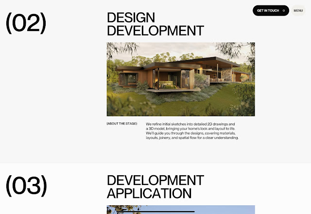
|
| Fig 3.4: Clear, structured breakdown of the firms project development stages |

|
| Fig 3.4: Clear, structured breakdown of the firms project development stages |
Performance and Compatibility: The website loads efficiently, with optimised images ensuring quick access to content. The design adapts seamlessly to various screen sizes, maintaining functionality and aesthetics across devices. The site performs consistently across major browsers, including Chrome, and Safari.

|
| Fig 3.5: Mobile view of the homepage |
Strengths:
- Clean, minimalist design that highlights project work.
- User-friendly navigation and responsive layout.
- Effective communication of the firm’s philosophy and services.
Weaknesses:
- Limited accessibility features, such as alt text for images.
- Lack of detailed project descriptions or client testimonials.
Recommendations:
- Enhance Accessibility by implementing alt text for images and ensure compatibility with screen readers to accommodate all users.
- Expand project details by providing comprehensive descriptions and include client testimonials to build trust and inform potential clients.
- Incorporate relevant keywords and meta descriptions to improve search engine visibility.
Conclusion: OH Architecture’s website effectively reflects the firm’s design ethos and client-focused approach. By addressing accessibility and content depth, the site can further enhance user experience and engagement.
Purpose and goals: EISLAB is a premium ice cream brand based in Germany that strives to provide an exceptional ice cream experience, combining sustainability with top-quality ingredients. The website’s main objective is to highlight their product range, showcase their dedication to eco-friendly practices, and attract potential franchise partners.The site successfully conveys this mission through striking visuals and clear, impactful messaging. Slogans like “every spoon is a joyful journey” and “always premium, always sustainable” reflect the brand’s core values.

|
| Fig 4.1: Homepage showcasing the brands message and product offerings |
Design and Layout: The site employs a clean, modern aesthetic with a focus on high-quality images of their ice cream products. The color palette is soft and inviting, complementing the brand’s identity.
A straightforward layout guides users through the product offerings, store locations, and franchise information. The use of whitespace and consistent typography enhances readability.

|
| Fig 4.2: Product showcase highlighting the variety of ice cream flavours |
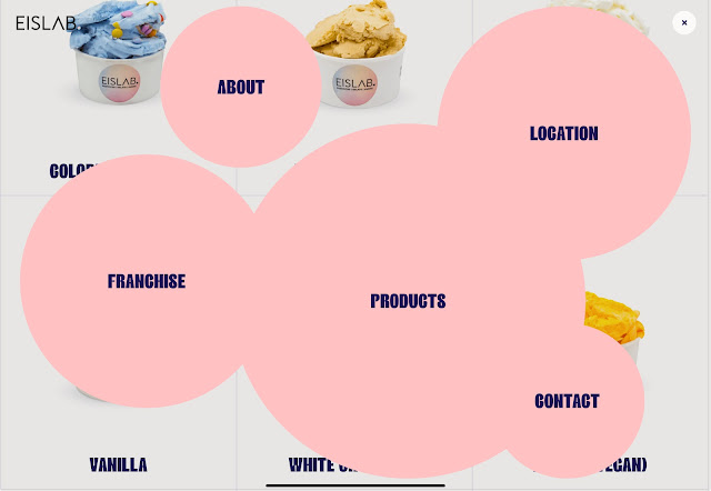
Functionality and Usability: The main menu provides clear links to essential pages: Products, Location, Contact, Franchise, and About. The site’s responsive design ensures usability across devices.
Interactive features are minimal but effective, allowing users to explore product details and store information seamlessly.

|
|
Fig 4.3: Clear navigation for easy browsing |
Content Quality and Relevance: Content is informative, detailing product ingredients, the brand’s commitment to sustainability, and opportunities for franchising. Information is well- structured, with each section providing relevant details without overwhelming the user.

|
| Fig 4.4: Informative content on franchising opportunities |
Performance and Compatibility: The website loads efficiently, with optimized images ensuring quick access to content.
The design adapts seamlessly to various screen sizes, maintaining functionality and aesthetics across devices.
The site performs consistently across major browsers, including Chrome, Firefox, and Safari.

|
| Fig 4.5: Mobile view of the homepage |
Strengths:
- Visually appealing design that highlights product offerings.
- Clear communication of brand values and mission.
- User-friendly navigation and responsive layout.
Weaknesses:
- Limited accessibility features, such as alt text for images.
- Minimal interactive elements or customer engagement features.
Recommendations:
- Increase interactivity by incorporating features like customer reviews or a blog to engage users and provide more in-depth information.
Conclusion: EISLAB’s website effectively reflects the brand’s commitment to quality and sustainability. By addressing accessibility and interactivity, the site can further enhance user experience and engagement.
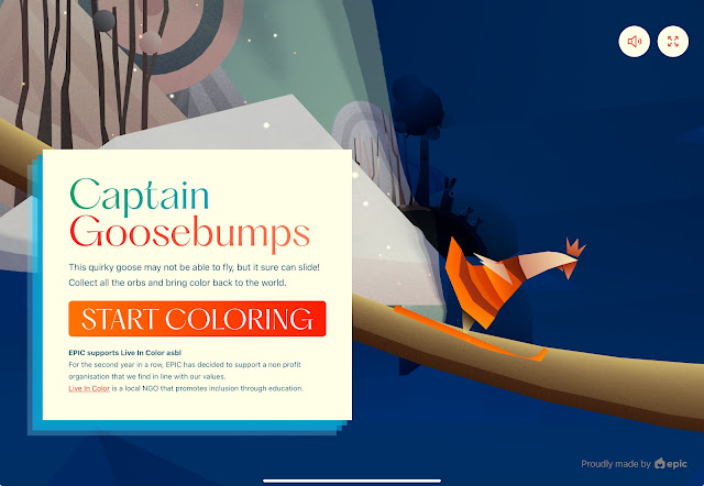
Purpose and Goals: “Captain Goosebumps” is an interactive browser based game developed by EPIC Agency. The primary objective is to engage users in a playful experience where they control a quirky goose character to collect orbs and restore colour to a monochromatic world. The game also serves a philanthropic purpose by promoting the NGO “Live In Color,” which focuses on inclusion through education.
The website effectively combines entertainment with social awareness. The game’s integration with the NGO’s mission encourages users to learn about and support the cause, aligning well with EPIC Agency’s values.

|
| Fig 5.1: Homepage introducing the game and its playful mission |
Design and Layout: The website employs a minimalist design with a focus on the game’s vibrant visuals. The use of color progression, from grayscale to vivid hues as players collect orbs reinforces the theme of bringing color back to the world. Typography is clean and legible, complementing the overall aesthetic.
A single page layout ensures simplicity, with all essential elements; game canvas, instructions, and links, readily accessible without scrolling.

|
| Fig 5.2: In game view showing the transformation from grayscale to colour |
Functionality and Usability:The website’s straightforward design eliminates the need for complex navigation. Users can start the game immediately upon loading the page.
The game responds to keyboard inputs (spacebar to jump) and touch controls for mobile devices. A timer tracks the duration spent “coloring the world,” adding a gamified metric to user engagement.

|
| Fig 5.3: Gameplay features like timer and restart option |
Content Quality and Relevance: Instructions are concise, ensuring users understand gameplay mechanics quickly. Information about “Live In Color” is presented clearly, with links for users to explore further.
Content is well structured, with the game’s objective, controls, and philanthropic message seamlessly integrated into the user experience.

|
| Fig 5.4: Promoting social impact through partnership with “Live in Colour” |
Performance and Compatibility: The website loads efficiently, with optimized assets ensuring minimal wait times. The game adapts smoothly to various screen sizes, maintaining functionality across desktops, tablets, and smartphones. The site performs consistently across major browsers, including Chrome, and Safari.

|
| Fig 5.6: Mobile view of the game |
Strengths:
- Engaging gameplay that combines entertainment with a social cause.
- Minimalist design ensuring user focus on the game.
- Responsive and compatible across devices and browsers.
Weaknesses:
- Limited accessibility features, such as alt text for images.
- No traditional navigation menu, which may hinder users seeking additional information.
Recommendations:
- Include a navigation menu or footer links directing users to more details about EPIC Agency and “Live In Color.”
- Offer varying difficulty levels or additional challenges to encourage repeated engagement.
Conclusion: “Captain Goosebumps” successfully delivers an enjoyable gaming experience while promoting a meaningful cause. By addressing informational enhancements, the website can further improve user engagement and inclusivity.
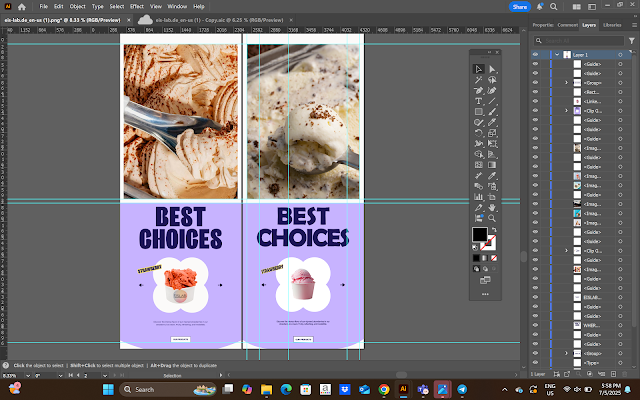
Exercise 2 - Web Replication

|
| Final Web Replication- EISLAB Ice cream |


Comments
Post a Comment